ShopDreamUp AI ArtDreamUp
Deviation Actions


Suggested Deviants


Suggested Collections


You Might Like…


Featured in Groups


Description
Check out the e/book here! :www.blacklibrary.com/games-wor…
Illustration © Games Workshop
Art director/producer: Darius Hinks
+++++++++++++++++++
Hi all, its been a while! I've been keeping busy working for the wonderful folks at GW/Black Library on illustrations for their various Codex covers, Novels and their audiobook line, as well as more IG covers for Fantasy Flight Games. For the fans of the franchise- that basically means there's quite a backlog now that have yet to be announced... (Wink)")
Amidst all this grimdark carnage of the 41st Millenium I am spending my free time developing my indie "cyber spacepunk" game project which I'll be sharing more info on as soon as I can :v Not only is it a bucketlist item of mine but I find it keeps the voices of Chaos at bay...
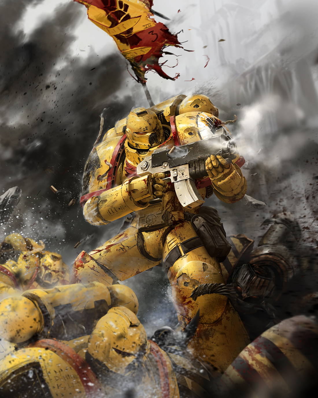
So anyways, back to The Imperial Fists, and was probably the most self-pressuring coverwork to date simply because its former IFS colleague and now GW artist Kevin Chin's favourite chapter. The brief was as always, brief(hur hur), along the lines of "make 3rd coy marine look good while wielding a two handed bolter, and it would be nice to have some iron warriors in it if possible".
Tangent: I can tell you that my respect goes up exponentially to the artists at GW with every similar worded brief, for 'simply' being able to draw the same specce muhreens doing their thing for decades, and keeping it fresh somehow.
So like with my other GW illustrations, I turned to visual metaphor to hopefully add a little something extra for the fans. My first cheeky try was him looking like he was taking the full force of the explosion and trying to stay up, which was off brand and so heretical to see a marine flinch that I had to think of a different way to present my idea.") In this final direction, the Fist is almost effortlessly bracing against the shockwave of some heavy artillery impacting next to him. I thought it was a subtle enough nod to their infamous fortitude and stubborness and almost natural enough to be handwaved as a natural byproduct of a crazy warzone. Form and function OCD streak not completely satisfied, I then turned my attention to the suit. I put this off objectively to incompetence on my end as an illustrator, but I find it quite a necessity to exaggerate certain proportions to lend personality to the characters that I illustrate. But I really hate to be too blatant about it and enjoy challenging myself to redesigning functional bits of armour to achieve that same aesthetic goal while hopefully maintaining the illusion that the human form within it remains unchanged. And where it comes to marines in armour, I've thankfully been given a pretty wide berth. For this Errant Pattern wearing soldier, one of the first things that came to mind was bulky arms, definitely Joe Mad inspired
In this final direction, the Fist is almost effortlessly bracing against the shockwave of some heavy artillery impacting next to him. I thought it was a subtle enough nod to their infamous fortitude and stubborness and almost natural enough to be handwaved as a natural byproduct of a crazy warzone. Form and function OCD streak not completely satisfied, I then turned my attention to the suit. I put this off objectively to incompetence on my end as an illustrator, but I find it quite a necessity to exaggerate certain proportions to lend personality to the characters that I illustrate. But I really hate to be too blatant about it and enjoy challenging myself to redesigning functional bits of armour to achieve that same aesthetic goal while hopefully maintaining the illusion that the human form within it remains unchanged. And where it comes to marines in armour, I've thankfully been given a pretty wide berth. For this Errant Pattern wearing soldier, one of the first things that came to mind was bulky arms, definitely Joe Mad inspired  (Smile)") Something I felt would complement the wide collar and 'compact' 2-handed grip that was needed to keep a marine centered in a shot without going stylistically overboard. So one idea I had, more of a spillover from my Phobos Tactica piece was a dual layer gauntlet that doesnt add bulk to the hand -so dexterity can be maintained in the grip- but just adding protection to where its needed most, forearm and top of hand. The bevels and hinge were smoothened down to maintain the more classic space marine 'cut off at the cuff' gauntlet silhouette. Fingertips are tapered to better sink into the eye sockets of opponents I suppose?
Something I felt would complement the wide collar and 'compact' 2-handed grip that was needed to keep a marine centered in a shot without going stylistically overboard. So one idea I had, more of a spillover from my Phobos Tactica piece was a dual layer gauntlet that doesnt add bulk to the hand -so dexterity can be maintained in the grip- but just adding protection to where its needed most, forearm and top of hand. The bevels and hinge were smoothened down to maintain the more classic space marine 'cut off at the cuff' gauntlet silhouette. Fingertips are tapered to better sink into the eye sockets of opponents I suppose?
One other element I fondly recall spending unnecessary time debating with myself on was the thigh bag which I really wanted in, cause if you're a heavy duty defender you're going to need ammo... and for some aesthetic reason a standard buckle just didn't seem right. It called too much attention to itself. So I decided with an inverse button setup or something that resembled a velcro-quick application(without...you know..being..velcro..) with padded material to give it some bulk.
Lastly, one thing I really adored in the classic 40k imagery was that sexy fashion magazine waxy gloss on marine armour. And while hunting for more modern takes on the imperial fists, Neil Robert's Shadows of Treachery fists boarding party looked so sick especially with the gloss look I remembered as a kid I had to just throw in the gloss effect for inspiration sake. Seems legit enough even in ground war, plenty of downtime during the siege to polish up and keep your gear clean! Wax on... wax off... grasshoppah
In any case I hope you Imperial Fists loyalists out there enjoyed this tribute to your chapter, to Dorn, and to glory!
Illustration © Games Workshop
Art director/producer: Darius Hinks
+++++++++++++++++++
Hi all, its been a while! I've been keeping busy working for the wonderful folks at GW/Black Library on illustrations for their various Codex covers, Novels and their audiobook line, as well as more IG covers for Fantasy Flight Games. For the fans of the franchise- that basically means there's quite a backlog now that have yet to be announced...
Amidst all this grimdark carnage of the 41st Millenium I am spending my free time developing my indie "cyber spacepunk" game project which I'll be sharing more info on as soon as I can :v Not only is it a bucketlist item of mine but I find it keeps the voices of Chaos at bay...
So anyways, back to The Imperial Fists, and was probably the most self-pressuring coverwork to date simply because its former IFS colleague and now GW artist Kevin Chin's favourite chapter. The brief was as always, brief(hur hur), along the lines of "make 3rd coy marine look good while wielding a two handed bolter, and it would be nice to have some iron warriors in it if possible".
Tangent: I can tell you that my respect goes up exponentially to the artists at GW with every similar worded brief, for 'simply' being able to draw the same specce muhreens doing their thing for decades, and keeping it fresh somehow.
So like with my other GW illustrations, I turned to visual metaphor to hopefully add a little something extra for the fans. My first cheeky try was him looking like he was taking the full force of the explosion and trying to stay up, which was off brand and so heretical to see a marine flinch that I had to think of a different way to present my idea.
One other element I fondly recall spending unnecessary time debating with myself on was the thigh bag which I really wanted in, cause if you're a heavy duty defender you're going to need ammo... and for some aesthetic reason a standard buckle just didn't seem right. It called too much attention to itself. So I decided with an inverse button setup or something that resembled a velcro-quick application(without...you know..being..velcro..) with padded material to give it some bulk.
Lastly, one thing I really adored in the classic 40k imagery was that sexy fashion magazine waxy gloss on marine armour. And while hunting for more modern takes on the imperial fists, Neil Robert's Shadows of Treachery fists boarding party looked so sick especially with the gloss look I remembered as a kid I had to just throw in the gloss effect for inspiration sake. Seems legit enough even in ground war, plenty of downtime during the siege to polish up and keep your gear clean! Wax on... wax off... grasshoppah
In any case I hope you Imperial Fists loyalists out there enjoyed this tribute to your chapter, to Dorn, and to glory!
Image size
1100x1376px 709.07 KB
© 2013 - 2024 ukitakumuki
Comments177
Join the community to add your comment. Already a deviant? Log In
You’re open of the many sci-fi artists I looked up to when I was younger. I’ve always had this as a standard for where I wanted my art to be and I never thought I’d get to where I am now.
I’m going to illustrate an Imperial Fist composition in your honor